SNAZZ CORPORATE IDENTITY SNAZZ CORPORATE IDENTITY SNAZZ CORPORATE IDENTITY SNAZZ CORPORATE IDENTITY SNAZZ CORPORATE IDENTITY
Project
Snazz
Deliverables
Brand Strategy
Brand Concept
Brand Materials
Disciplines
Graphic Design
Motion Design
Media
Digital
Summary
Snazz is an upcoming Berlin startup that aims to build an app where users can post their outfits and recieve feedback from other users.
As part of an Identity Design university course, I developed a brand concept and visual identity for Snazz.
As part of an Identity Design university course, I developed a brand concept and visual identity for Snazz.
Jump to
STRATEGY STRATEGY STRATEGY STRATEGY STRATEGY STRATEGY STRATEGY
Overview
Snazz allows users to get feedback and inspiration on their day to day fashion choices by posting their outfits on the app. In addition, the app aims to share the fashion data collected from users to forecast trends that help manufacturers optimize their production, thus reducing fashion waste.
Accordingly, I devised the app’s Brand Statement, Mission and Values as follows.
Accordingly, I devised the app’s Brand Statement, Mission and Values as follows.
Brand Statement
“We exist to foster an informed and conscious fashion community, in order to serve young fashion consumers, by giving them a community to inspire their style and an opportunity to contribute to sustainable fashion.”
Mission
“To provide fashion consumers with a community that inspires their everyday fashion decisions and an opportunitty to contribute to fostering responsible fashion consumption.”
Values
Target Audience
Snazz forecast their target audience to be social media and fashion savvy teens and young adults who are environmentally conscious.
Brand Personality
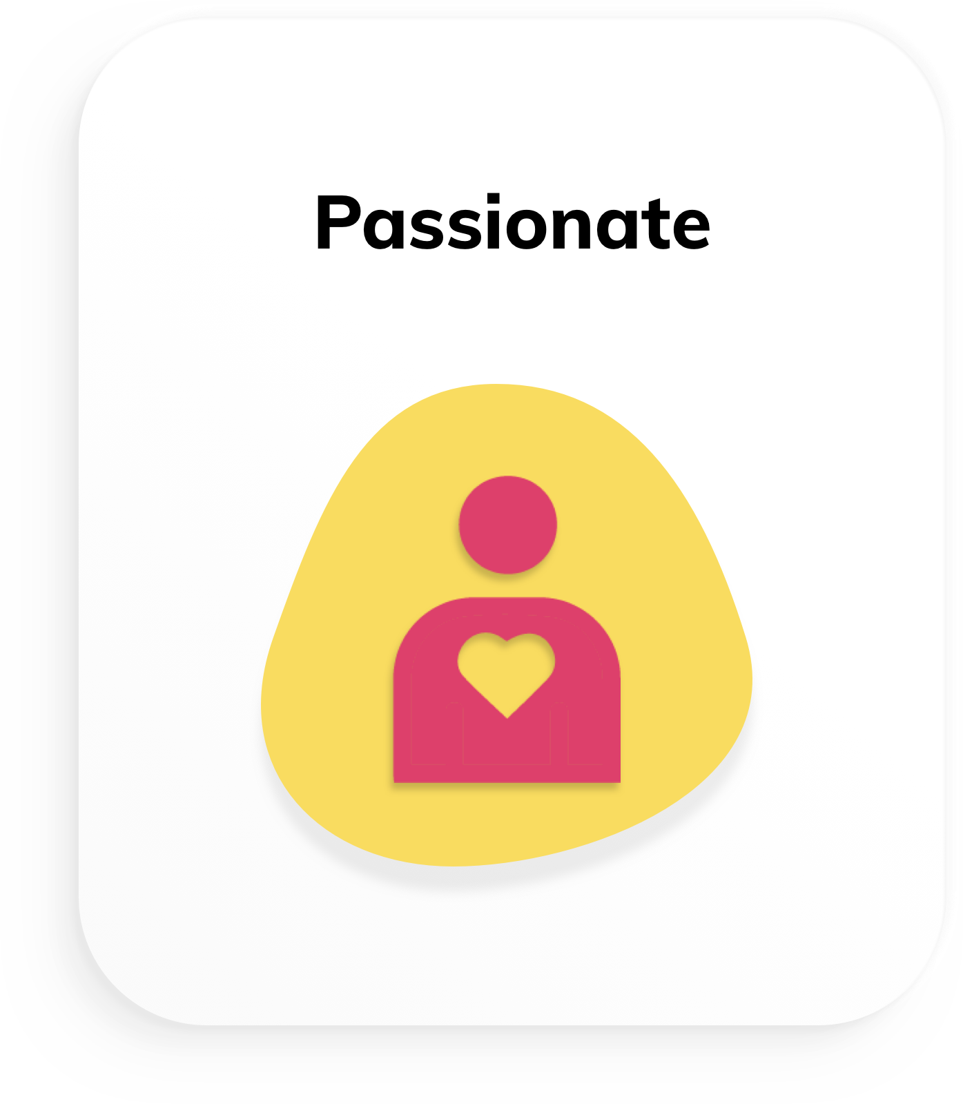
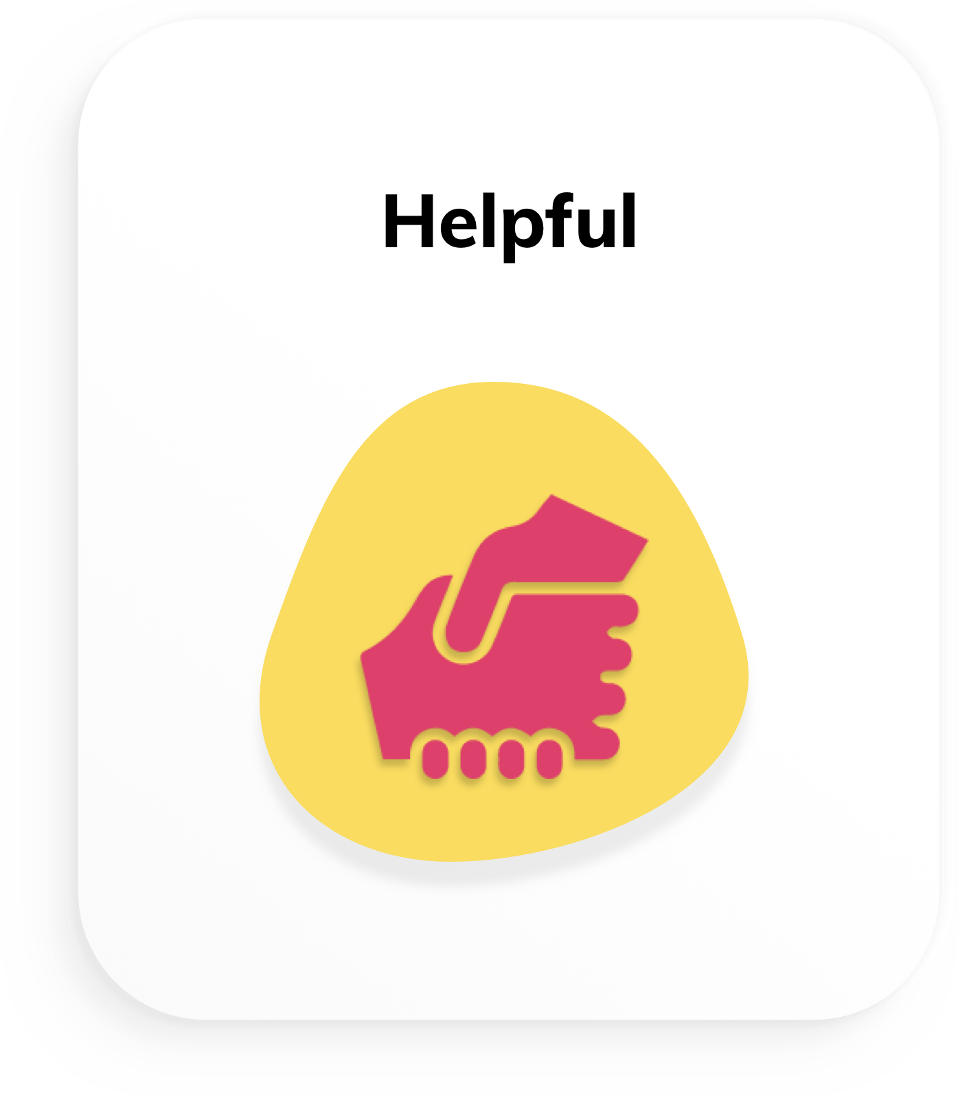
Given the specified target audience and values, I defined Brand Personalities that connect the two together. The main takeaways being playfulness, sincerity and passion for its values.

CONCEPT CONCEPT CONCEPT CONCEPT CONCEPT CONCEPT CONCEPT
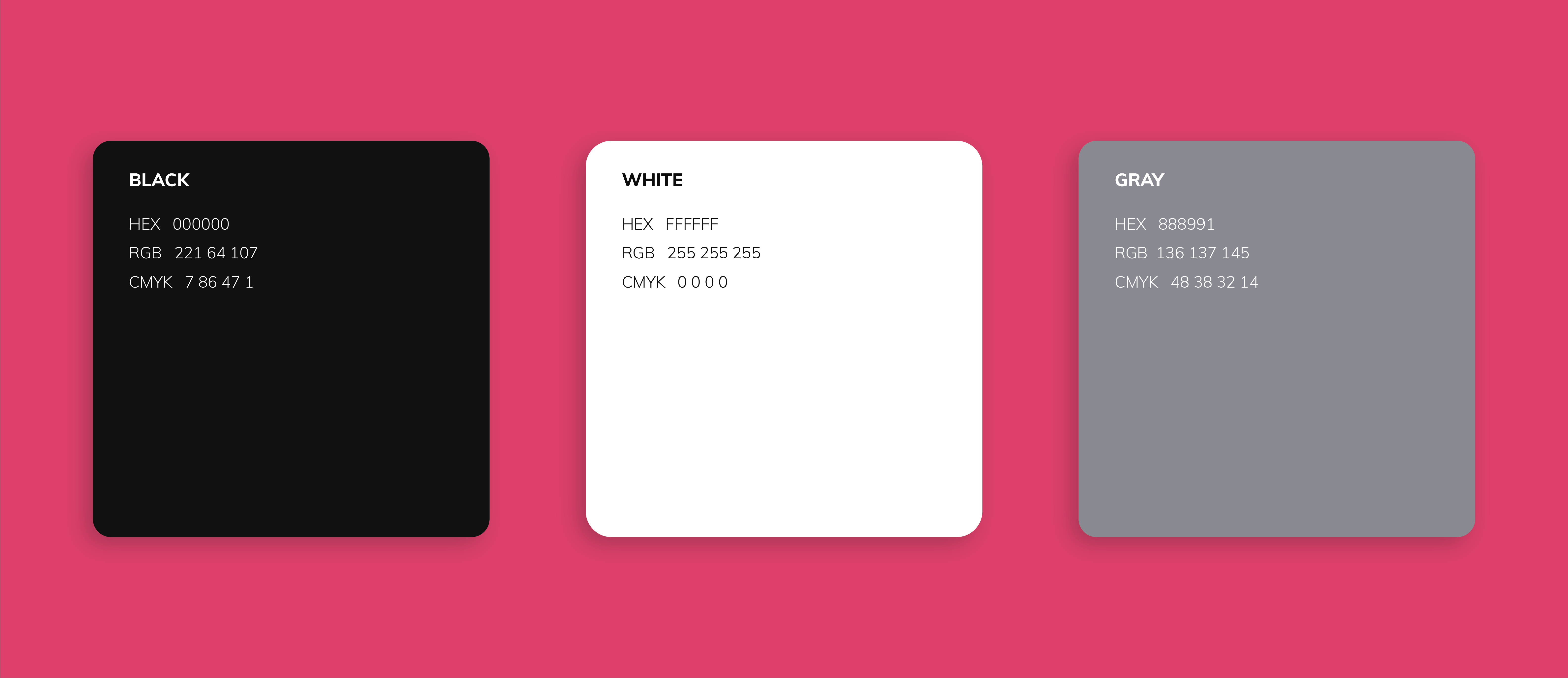
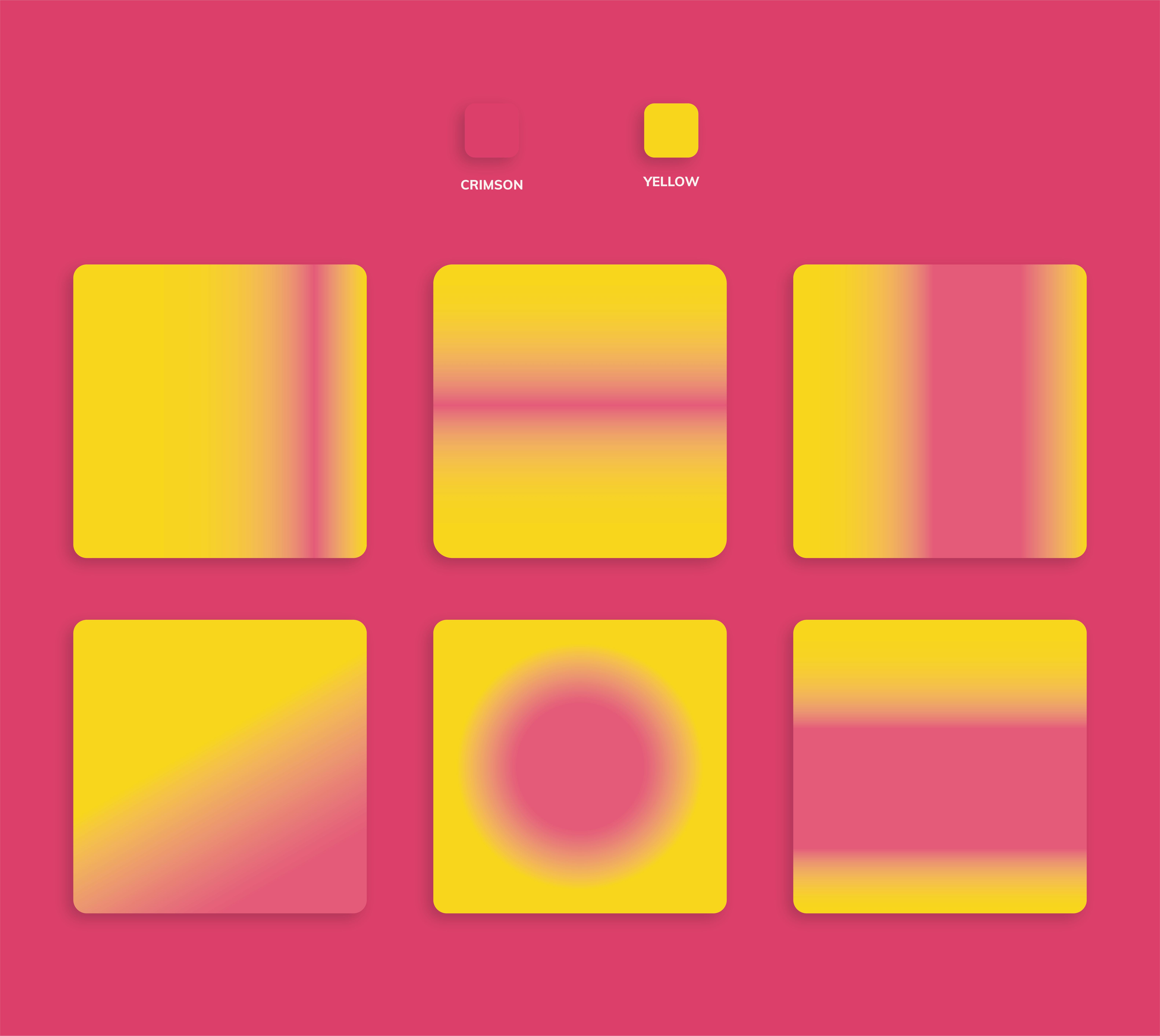
Color
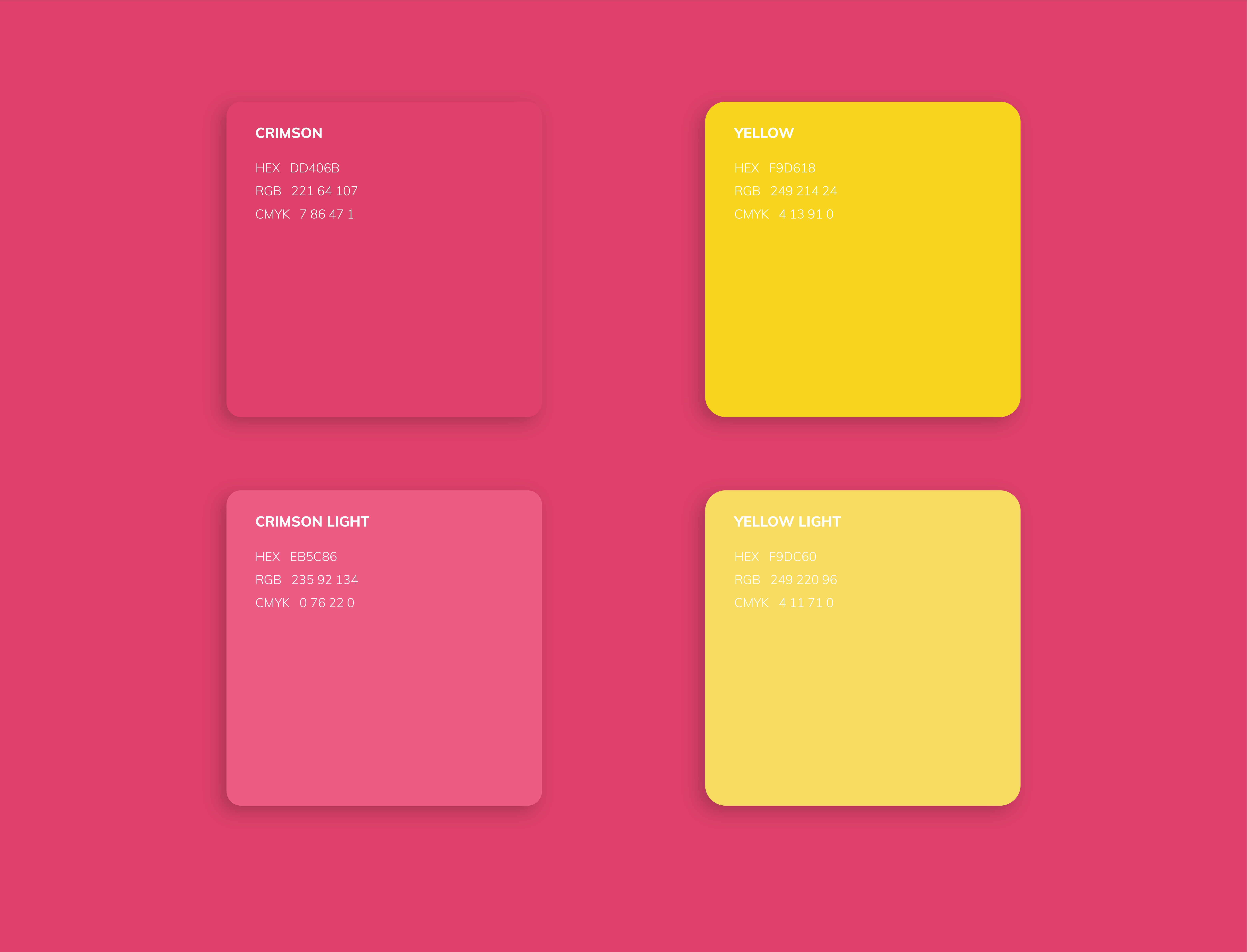
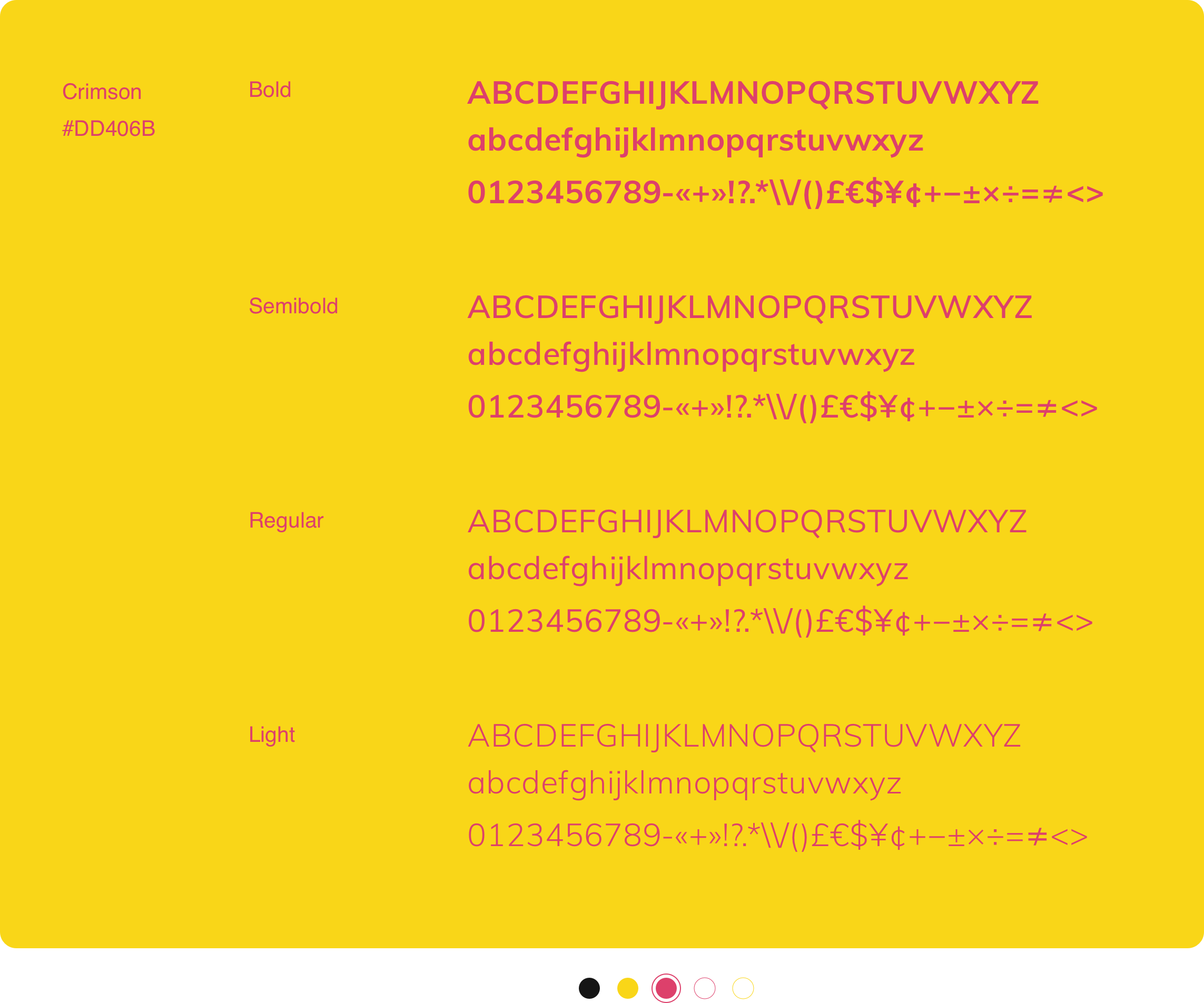
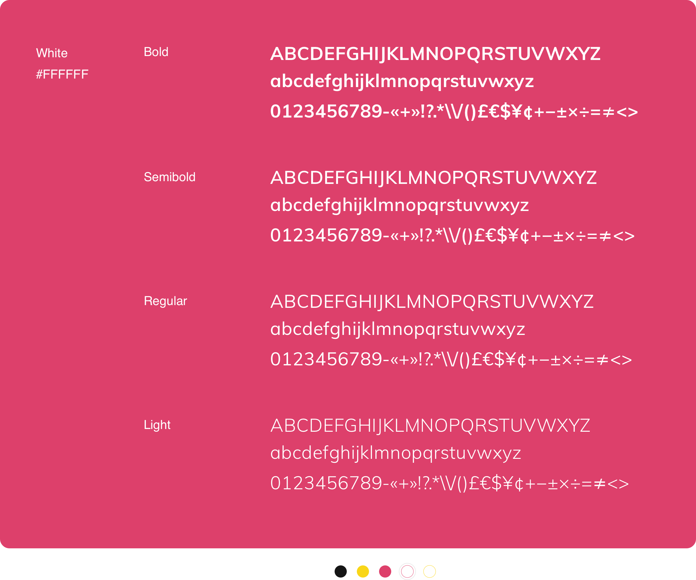
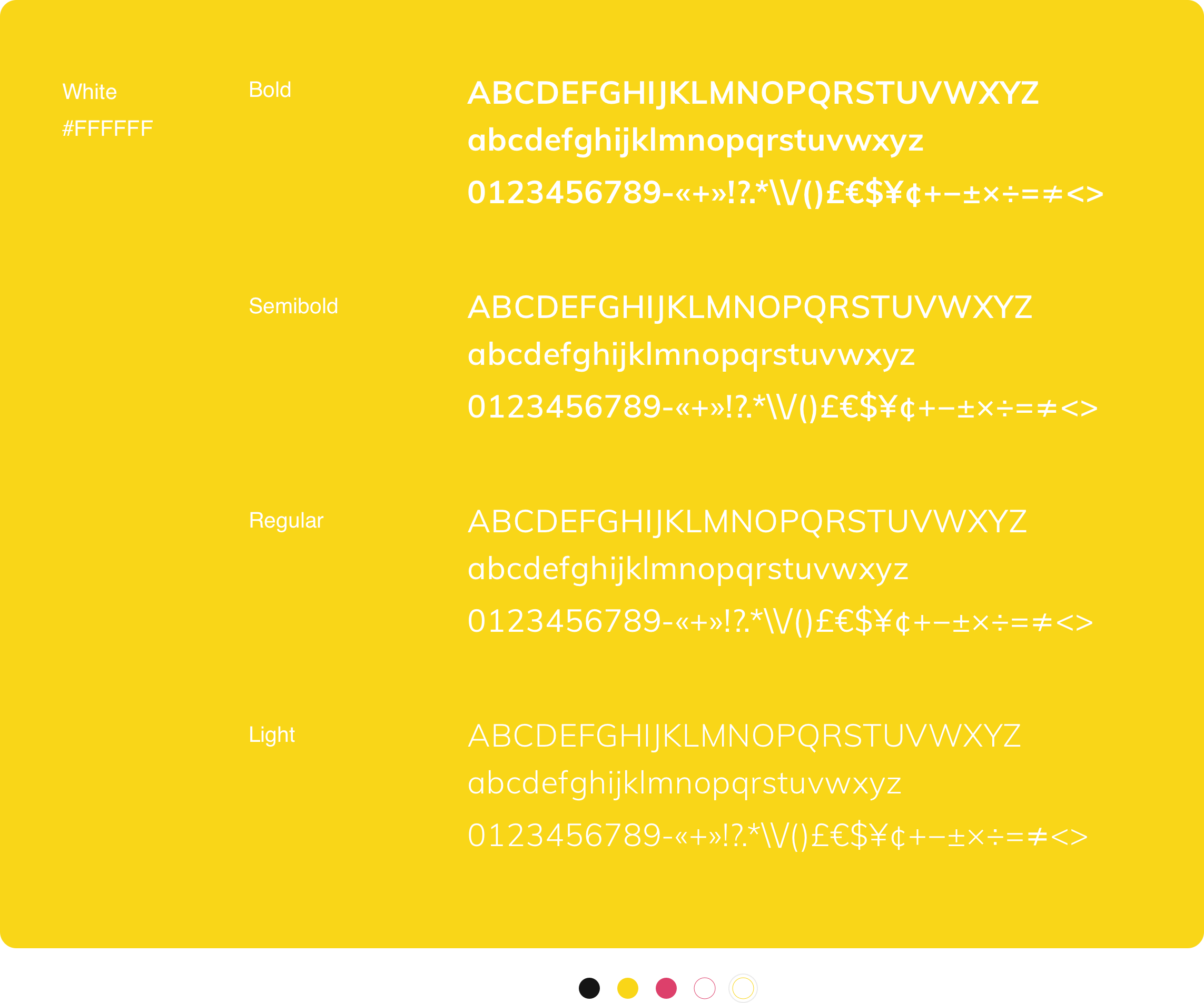
To communicate youth and playfulness, I wanted to use bold colors while limiting the palette to two colors so as to maintain consistency and trust.
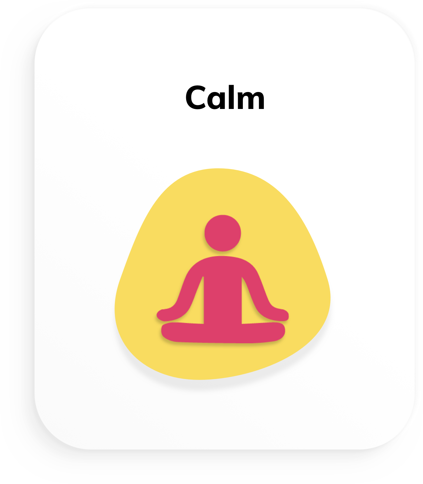
I picked shades of yellow and crimson to keep a balance between calm yet passionate personalities. Gradients would be used for compelling backgrounds.

Typography
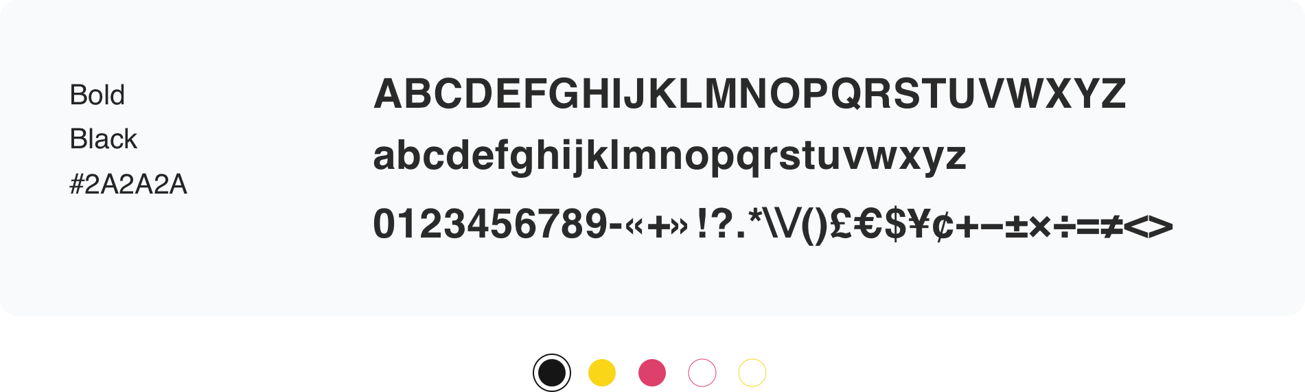

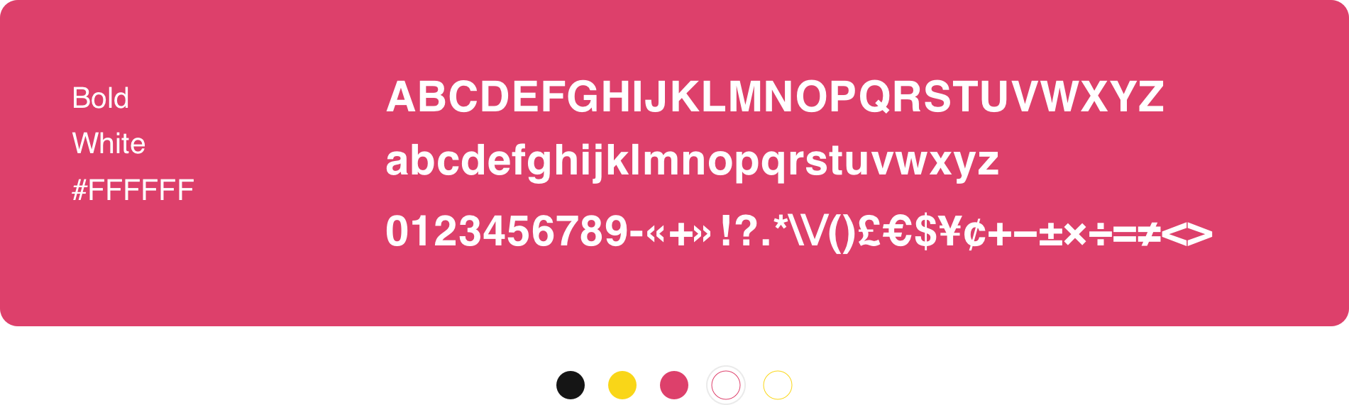
Helvetica
Helvetica is the typeface used for for large and brief headlines.
Usage
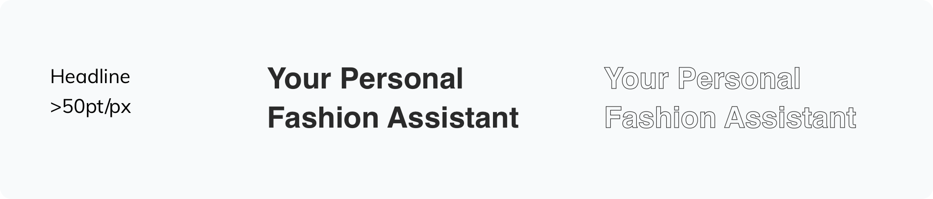
Set leading between 120–150%. Exceptions can be made for large headings above 50pt in print applications and 50px onscreen.
Never use below 50pt in print or 50px onscreen.
Type is usually left-aligned or centered. Never use fully justified. Text should never be hyphenated.
If your text is longer than 10 words, it’s best to use Muli instead.
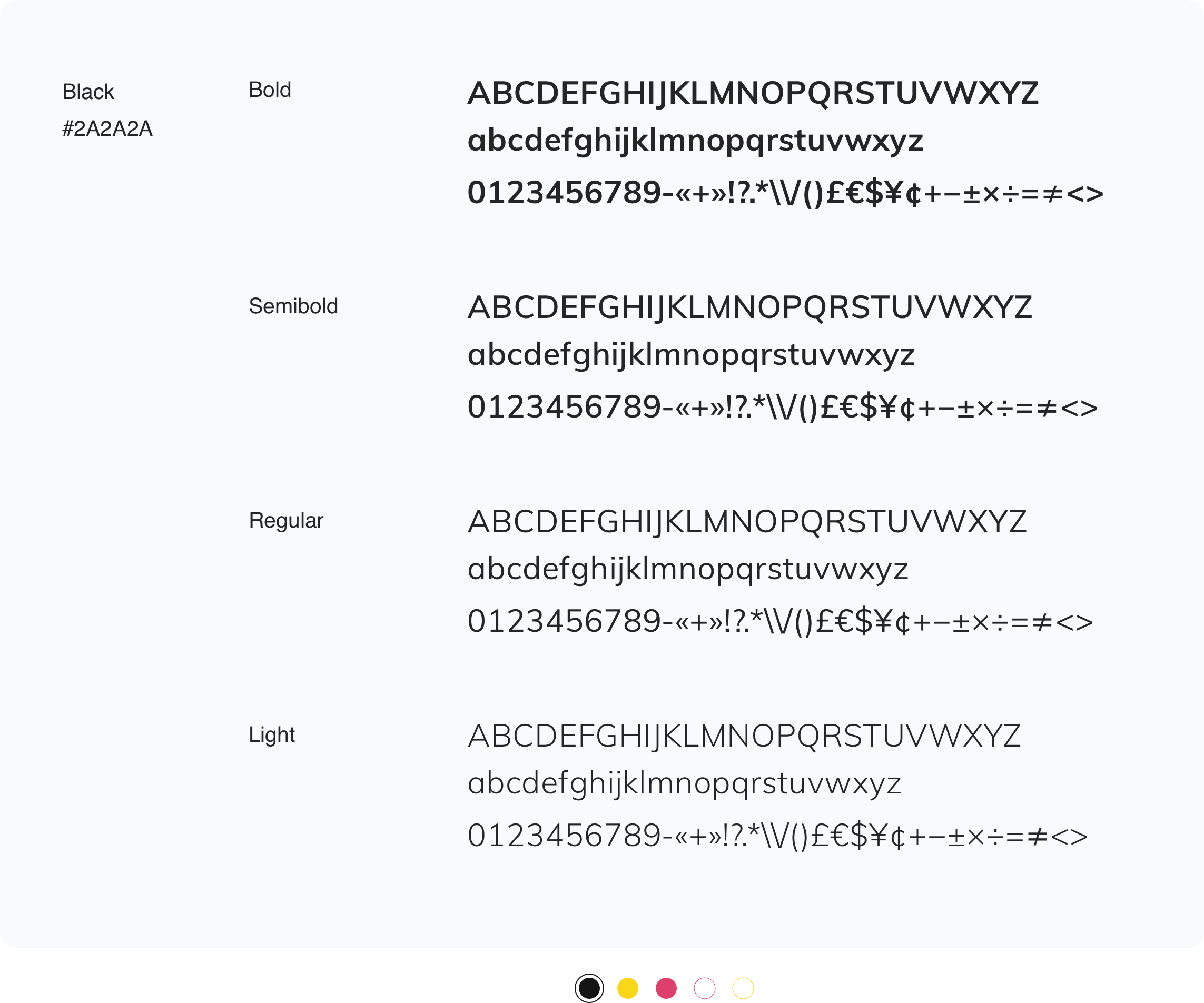
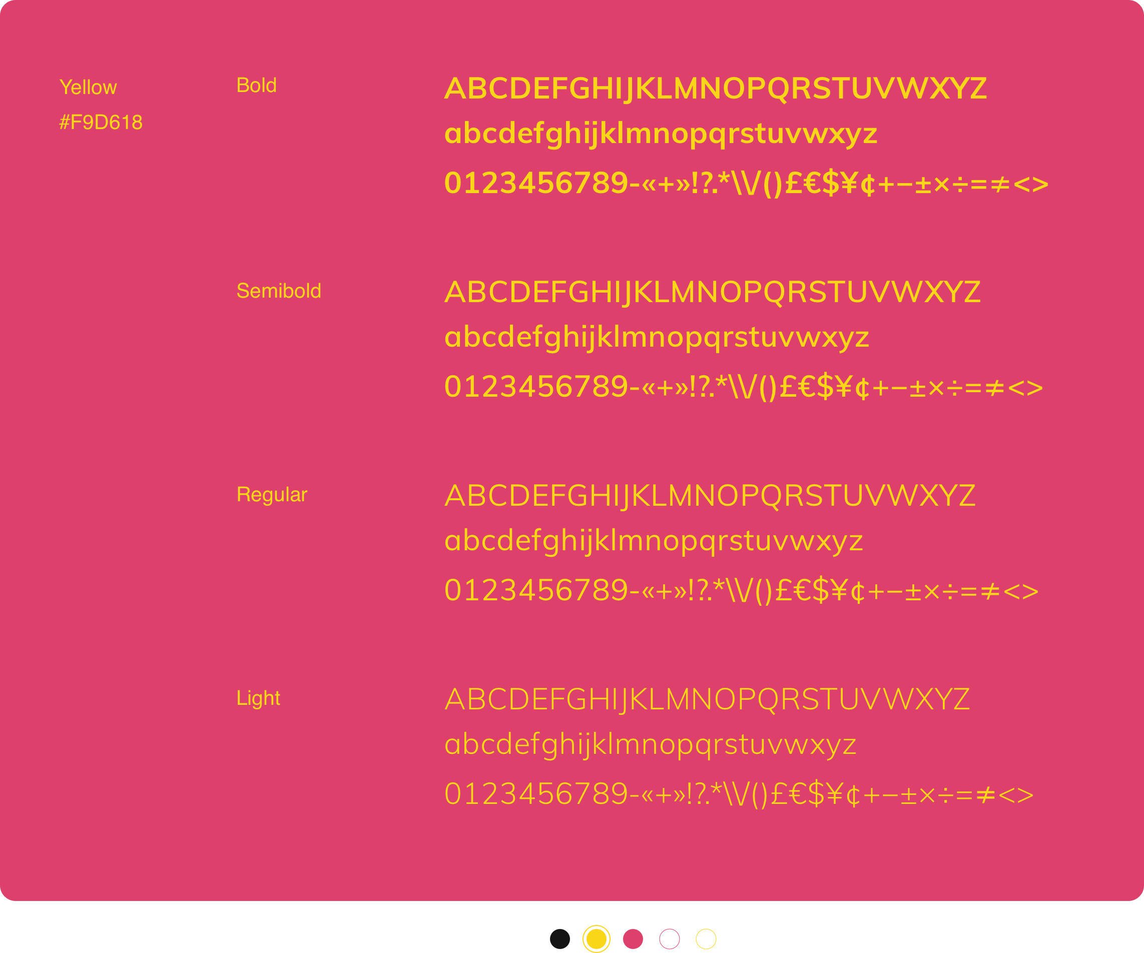
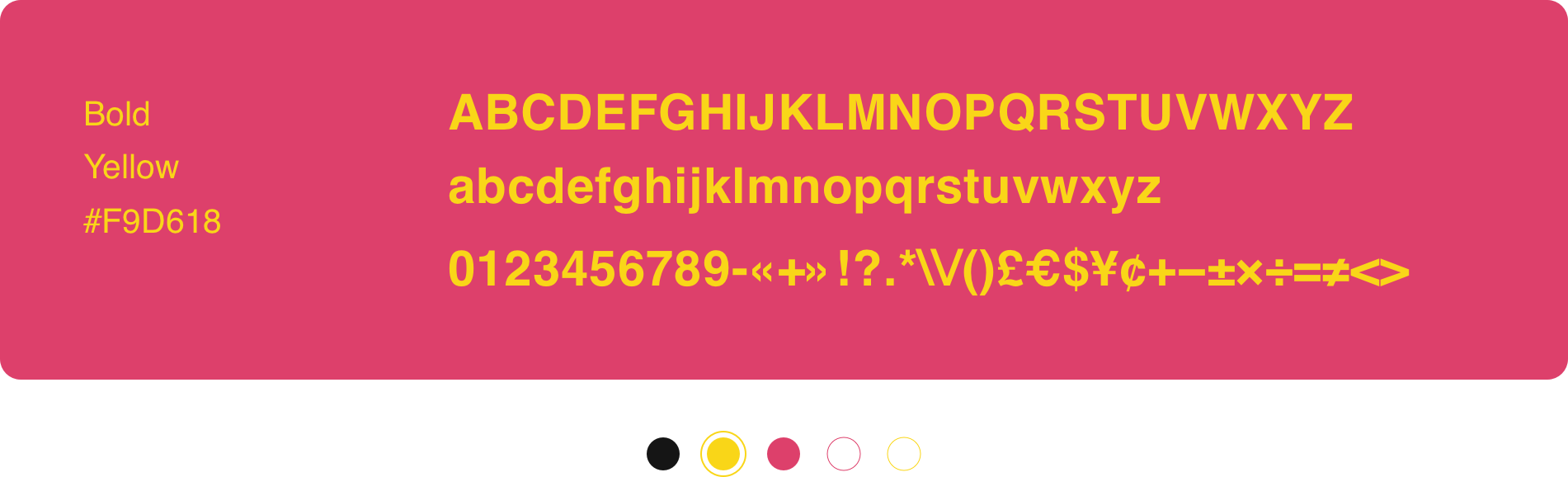
Muli
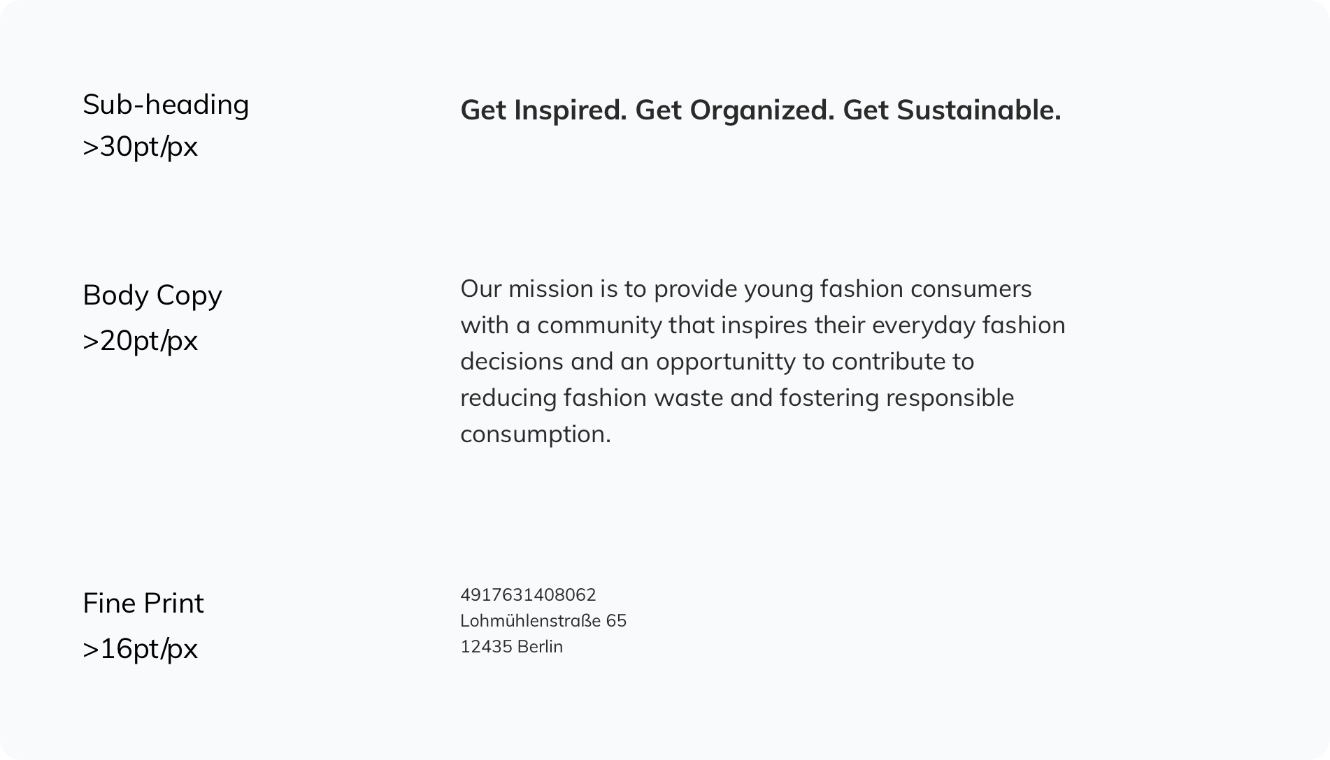
Muli is the typeface used for headlines 10 words or longer, subheadings and body copy.
Usage
Set leading to 120–150%. Exceptions can be made for large headings above 30pt in print applications and 30px onscreen.
Never use below 16pt in print or 16px onscreen.
Type is usually left-aligned or centered. Never use fully justified. Text should never be hyphenated.
Set leading to 120–150%. Exceptions can be made for large headings above 30pt in print applications and 30px onscreen.
Never use below 16pt in print or 16px onscreen.
Type is usually left-aligned or centered. Never use fully justified. Text should never be hyphenated.

Combination
When using Helvetica and Muli together:
Always align left.
Aim to use Helvetica 150% larger than Muli.
Bring the two fonts together by using equal leading throughout the block of copy when possible.
Do not combine the two fonts within the same sentence.
APPLICATION APPLICATION APPLICATION APPLICATION APPLICATION APPLICATION APPLICATION APPLICATION
Design
Below is a showcase of the newly designed identity applied to various assets within digital and print media.